

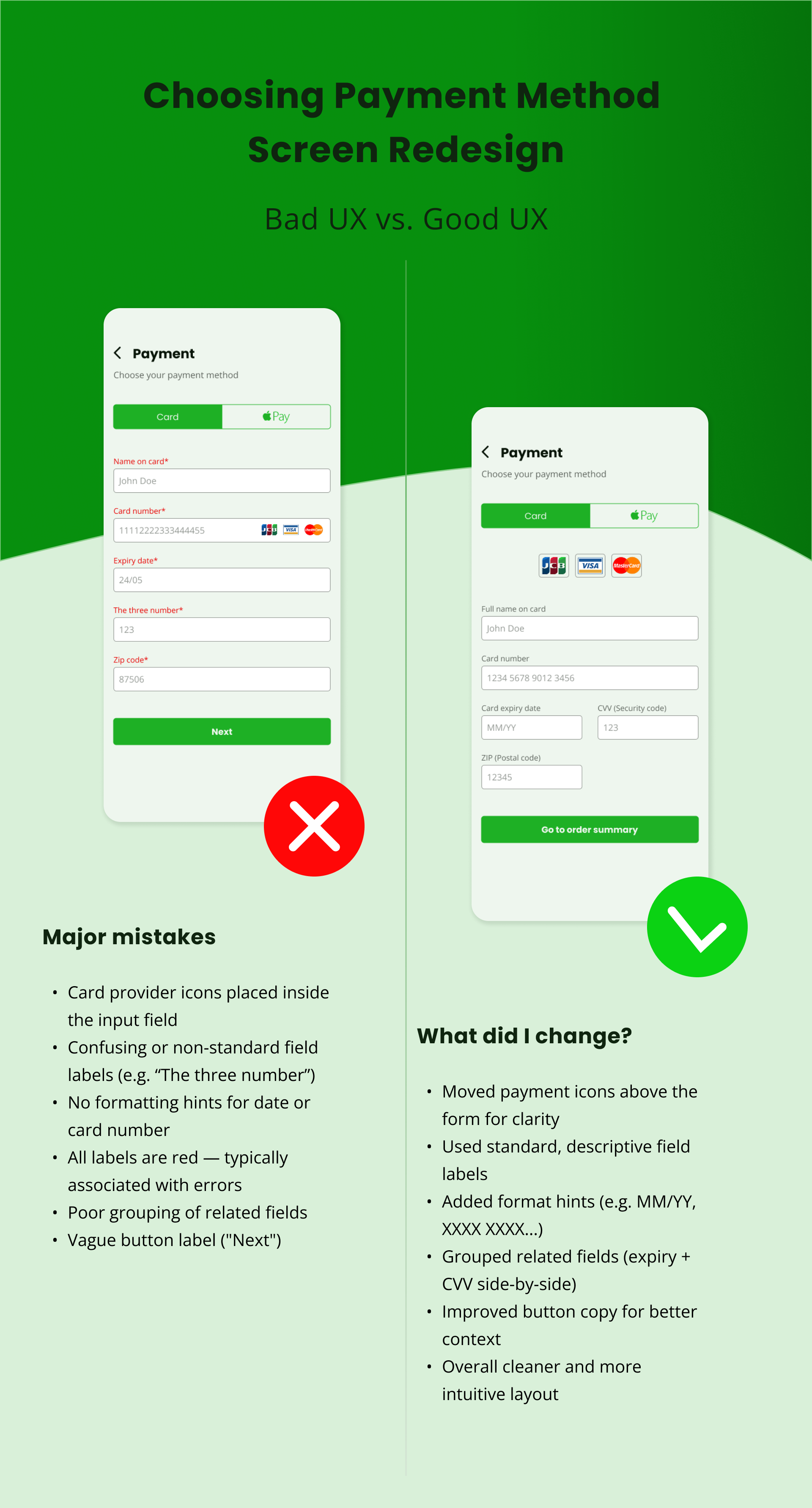
In this UX case study, I redesigned the payment method selection screen to improve clarity and usability. The original version suffered from unclear, cluttered layout, and non-standard field labels (e.g. “The three number”), which could confuse users and reduce form completion rates. I also noticed a misuse of color, where red labels implied errors even when fields were valid.
The new design introduces a cleaner structure, proper grouping of related fields, and standard terminology like “CVV” or “ZIP (Postal code)”. Format hints such as “MM/YY” and spaced card numbers were added for clarity. Payment method icons were moved outside the input fields, and the call-to-action button now clearly communicates the next step. This redesign improves readability, reduces cognitive load, and provides a more secure and professional impression — all essential for a smooth checkout experience.